 |
|
You are here: Leader.IT>MasonSQL Web>InputWidgets>ButtonComponent (21 Sep 2016, JanezStangelj)Edit Attach
button.comp
The Button widget is a graphical control element that provides to user a simple way to trigger an event. On this page:Parameters
Parameter Name |
Description | Default Value |
|---|---|---|
width |
button width | Undefined. |
value |
value to render | Empty string. |
readonly |
can't change state if in readonly mode | Undefined. |
id |
Select ID. | Undefined. |
description |
Tooltip. | Empty string. |
caption_value |
if defined : the caption is set equal to Value. | Undefined. |
caption |
button text | 'Button_'.$id. |
bgcolor |
button color | Undefined. |
Examples
Demo
 The button demo is available here.
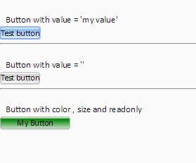
Button With Value
<h3>Button with value = 'my value'</h3>
<& /input/button.comp,
        id => 'test1',
        description => 'Descrizione pulsante',
        caption => 'Test button',
        value => 'my value',
        onclick => q|javascript: alert('Value=\''+this.get_value()+'\'')|
&>
Button Without Value
<& /input/button.comp,
        id => 'test2',
        description => 'Descrizione pulsante',
        caption => 'Test button',
        value => ' '
&>
Button With Attributes
<& /input/button.comp,
        id => 'test3',
        description => 'color , size and readonly',
        caption => 'My Button',
        value => '',
	width => 100,
	readonly => 1,
	bgcolor => 'green'
&>


| I | Attachment | Action | Size | Date | Who | Comment |
|---|---|---|---|---|---|---|
 PNG PNG |
buttonExample.PNG | manage | 5 K | 23 Apr 2016 - 18:39 | DipenPatel | Button examples |
Edit | Attach | Print version | History: r6 < r5 < r4 < r3 | Backlinks | View wiki text | Edit wiki text | More topic actions
Topic revision: r6 - 21 Sep 2016, JanezStangelj
 Blog
Blog
 Copyright (©) Leader.IT - Italy P.I. IT01434390223 Privacy policy & use of cookies