 |
|
You are here: Leader.IT>MasonSQL Web>InputWidgets>RadioComponent (21 Sep 2016, GuidoBrugnara)Edit Attach
radio.comp
The Radio Button widget allows the user to choose from one of a predefined set of options. Input Parameters:Parameters
| Parameter Name | Description | Default Value |
|---|---|---|
id |
Select ID. | Undefined. |
description |
Tooltip. | Empty string. |
value |
change read/write | Empty string. |
readonly |
can't change state if in readonly mode | Undefined. |
Examples
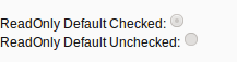
Readonly
readonly group set<br> <& /input/radio.comp, id => 'testA1', readonly => 1, value => 1 &> <br> <& /input/radio.comp, id => 'testA2', readonly => 1 &>
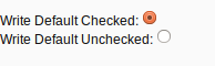
Write
write group set</br> <& /input/radio.comp, id => 'testB1', value => 1 &> <br> <& /input/radio.comp, id => 'testB2' &>
Demo
The demo demonstration is available here.

| I | Attachment | Action | Size | Date | Who | Comment |
|---|---|---|---|---|---|---|
 png png |
RadioReadOnly.png | manage | 3 K | 31 Mar 2016 - 18:19 | DipenPatel | Radio Read Only Group Example |
| png |
RadioReadWrite.png | manage | 3 K | 31 Mar 2016 - 18:20 | DipenPatel | Radio Read Write Group Example |
Edit | Attach | Print version | History: r3 < r2 < r1 | Backlinks | View wiki text | Edit wiki text | More topic actions
Topic revision: r3 - 21 Sep 2016, GuidoBrugnara
 Blog
Blog
 Copyright (©) Leader.IT - Italy P.I. IT01434390223 Privacy policy & use of cookies