 |
|
You are here: Leader.IT>MasonSQL Web>InputWidgets>CheckboxComponent (21 Sep 2016, JanezStangelj)Edit Attach
checkbox.comp
The Checkbox is commonly used when more than one option may need to be selected. Checking the box enables that option and unchecking it disables it. Input Parameters:Parameters
| Parameter Name | Description |
Default Value |
|---|---|---|
description |
Tooltip. | Empty string. |
id |
Select ID. | Undefined. |
value |
change read/write | Empty string. |
readonly |
can't change state if in readonly mode | Undefined. |
Examples
Demo
 The demonstration of the demo is available here.
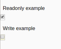
Readonly
here set "readonly => 1" to change state in readonly mode<& /input/checkbox.comp, id => 'test2', readonly =>1, value => 1, description => 'ReadOnly' &>
Write
Defaultreadony is undef. We can remove the parameter.
<& /input/checkbox.comp,
	id => 'test1',
	value => 0,
	description => 'ReadWrite'
&>


| I | Attachment | Action | Size | Date | Who | Comment |
|---|---|---|---|---|---|---|
 png png |
checkbox_example.png | manage | 4 K | 03 Apr 2016 - 15:06 | DipenPatel | CheckBox Example |
Edit | Attach | Print version | History: r10 < r9 < r8 < r7 | Backlinks | View wiki text | Edit wiki text | More topic actions
Topic revision: r10 - 21 Sep 2016, JanezStangelj
 Blog
Blog
 Copyright (©) Leader.IT - Italy P.I. IT01434390223 Privacy policy & use of cookies